Research, Product & Visual Design · 2020–2021

Corvus Insurance

For an AI-driven commercial insurer, I interviewed internal leaders and brokers, ran preference surveys and competitive mapping, and tested visual directions. I then built an accessible (WCAG AA) color, type, and illustration system that was rolled out across product and marketing.

  • User Research
  • Design Testing
  • Visual Design System

Result

NPS rose from 77 to 88 in 3 months, and cost per lead from paid social fell by more than 40% within 6 months.
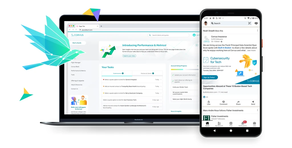
Corvus product screens on a laptop and phone beside the new geometric bird illustration.
Fig. 01The new visual system across product and marketing.
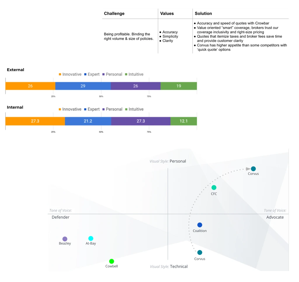
Research summary: challenge, values and solution, preference results from external and internal audiences, and a competitive map of visual style from technical to personal.
Fig. 02Preference surveys and competitive mapping with brokers and internal leaders.
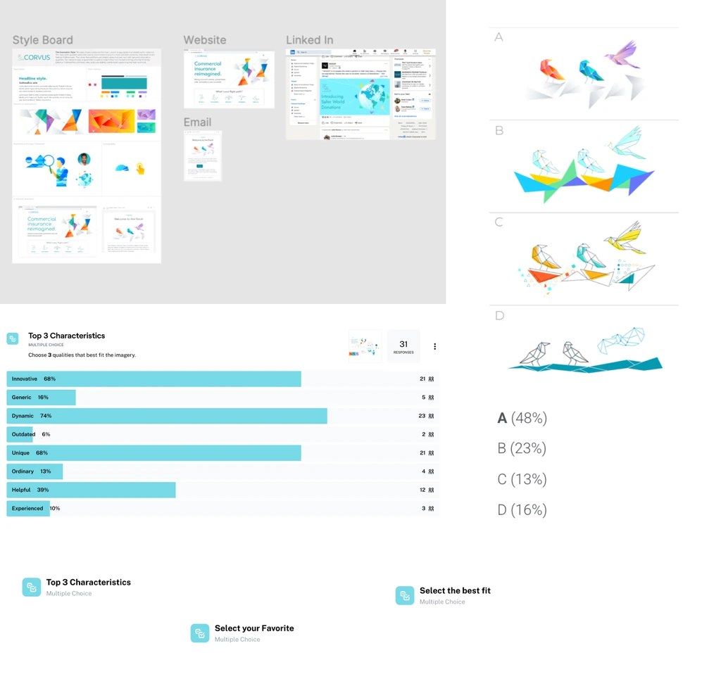
Design testing board: style board, website and LinkedIn concepts, top characteristics, and four illustration directions with their share of votes.
Fig. 03Testing visual directions with the audience before choosing one.
Fig. 04The documented system: accessible color, type, and illustration.

All brand and design work